Mappedin
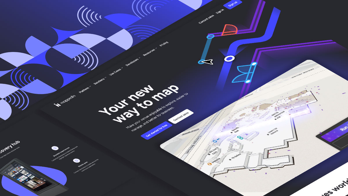
I was brought on at Mappedin to elevate the quality and consistency of all public-facing design, while also contributing to the ongoing evolution of the brand.
For thousands of years, people have relied on maps to explore new territories, build infrastructure, and organize communities. Today, digital tools like Apple Maps, Google Maps, and Waze have made outdoor navigation second nature. Getting from point A to point B is something most of us now do without thinking.
But this convenience typically ends at the front door. Navigating indoor environments with the same level of confidence, efficiency, and safety remains a challenge.
Mappedin addresses this gap by providing powerful indoor mapping solutions. Below is an example of a map I created for Highclere Castle, known to many as the filming location of Downton Abbey.
Overview
On average, people spend approximately 87% of their time indoors, yet less than 1% of indoor spaces have been mapped. This leaves billions of square feet around the world unexplored in digital form.
Mappedin is at the forefront of software innovation, enabling seamless navigation and management of indoor environments.
In my role at Mappedin, I not only maintained the brand but also drove its evolution and modernization to meet the demands of a rapidly changing industry.
The Problem
Mappedin’s recent growth created a critical need for scalable marketing design solutions. Design work was inconsistent, initially handled by an external agency and then passed down to internal teams to create materials. These teams began to create assets ad hoc, straying from consistencies, which slowed down campaign execution and made it nearly impossible to maintain a cohesive brand across all their marketing channels.
Solution
I led a comprehensive marketing design system overhaul in two phases.
Phase One established production efficiency through updated typography standards, reusable Lottie animations and video for presentations and social content, and template systems for sales decks, one-pagers, and marketing collateral, enabling the marketing team to produce professional materials quickly and consistently.
Phase Two introduced a refined color palette and modernized web design that created a cohesive visual language across all marketing channels.
The result: a scalable design system that empowered rapid content production without sacrificing brand quality.
Phase One
Typography
Introducing a new typeface
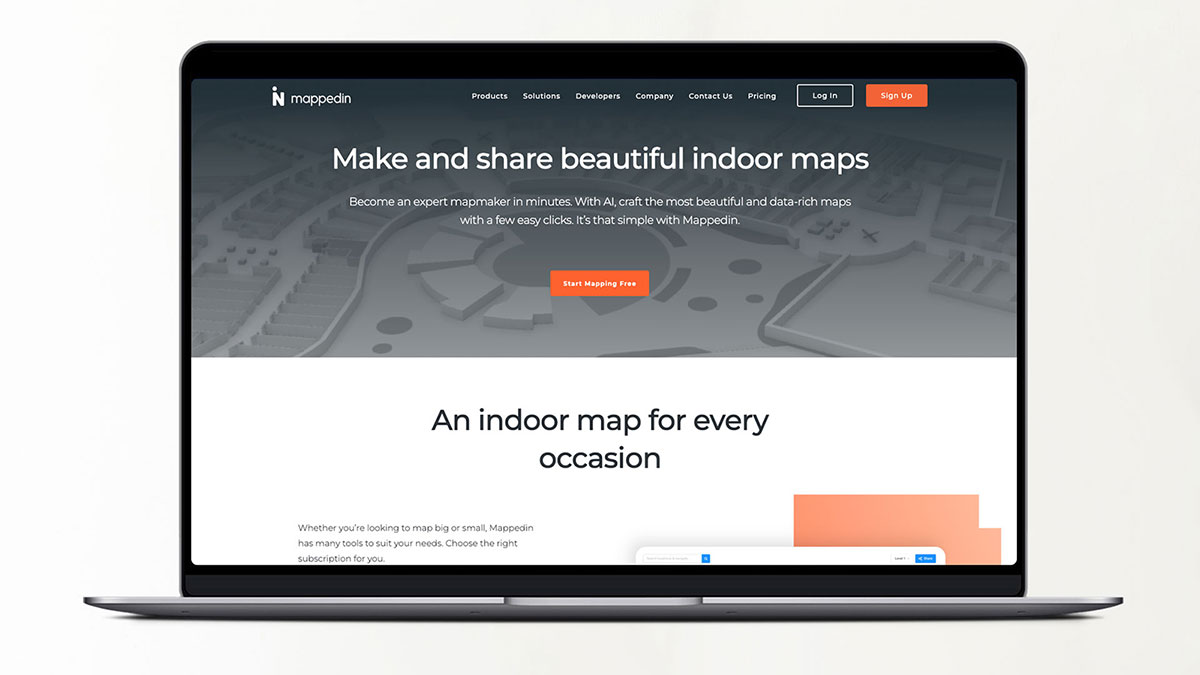
The existing brand guidelines designated Montserrat as Mappedin’s primary typeface. While well-suited for large-format headings and signage, Montserrat is less effective at smaller sizes. Its wide letterforms can cause reader fatigue and result in unnecessarily long paragraphs and extended page lengths, which impacts overall readability and user experience.
My initial objective was to select a typeface with similar characteristics to Montserrat that would improve readability at smaller sizes and occupy less space, ensuring that major changes remained subtle and the brand stayed familiar.
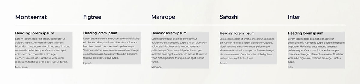
Further analysis revealed that Figtree shares many letterform characteristics with Montserrat, which is highly advantageous in making the transition feel seamless and natural.
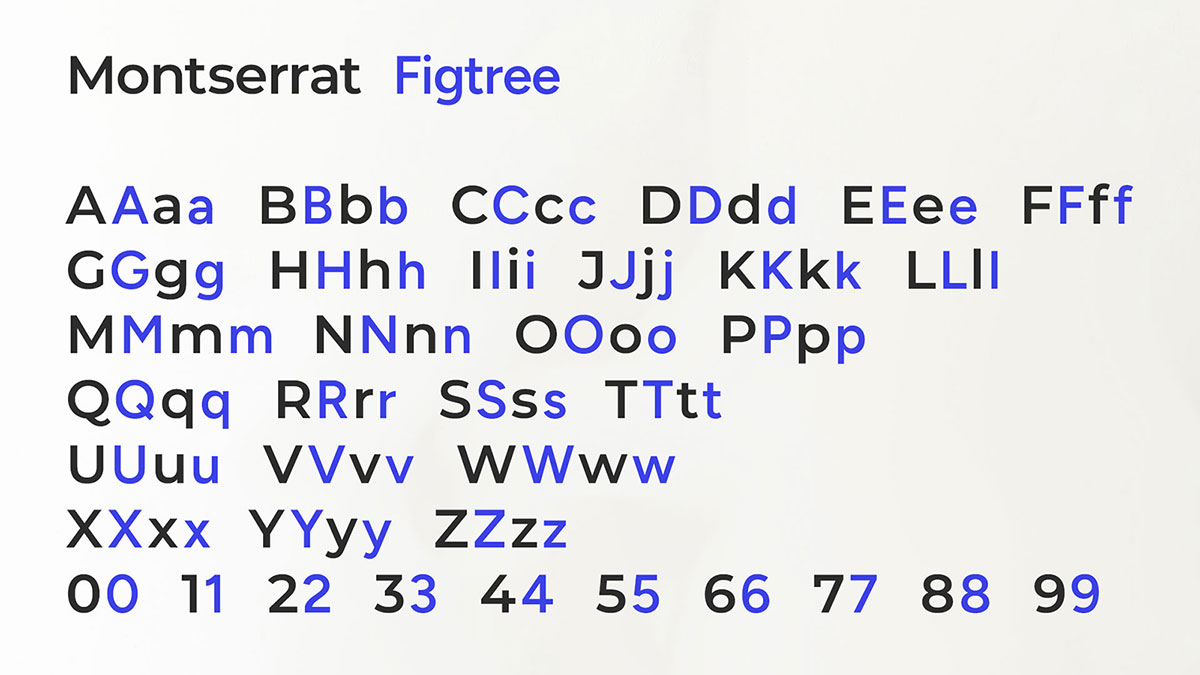
I chose to move forward with Figtree as a more approachable, space-efficient alternative to Montserrat. After presenting the typeface to the marketing team with a clear rationale, we quickly implemented it across our materials. Adapting the website was a more complex undertaking, requiring a thorough effort to replace the old fonts in both inline styles and CSS.
“Figtree is a clean yet friendly geometric sans serif font for usage in web and mobile apps. It’s light-hearted and crisp when used for text, yet still retains some punch when used in uppercase – perfect for buttons and short labels. The thicker weights have a distinctly friendlier character, great for headlines of more personable brands.”
Website
Part 1: Remove extraneous, over-designed elements
The existing colour scheme, outdated typeface, and inconsistent graphic elements contributed to a website that felt cluttered, outdated, and difficult to navigate. My primary objectives were to eliminate unnecessary design elements, improve usability and content hierarchy, implement proper heading structure, and reduce the overall cognitive load for users.
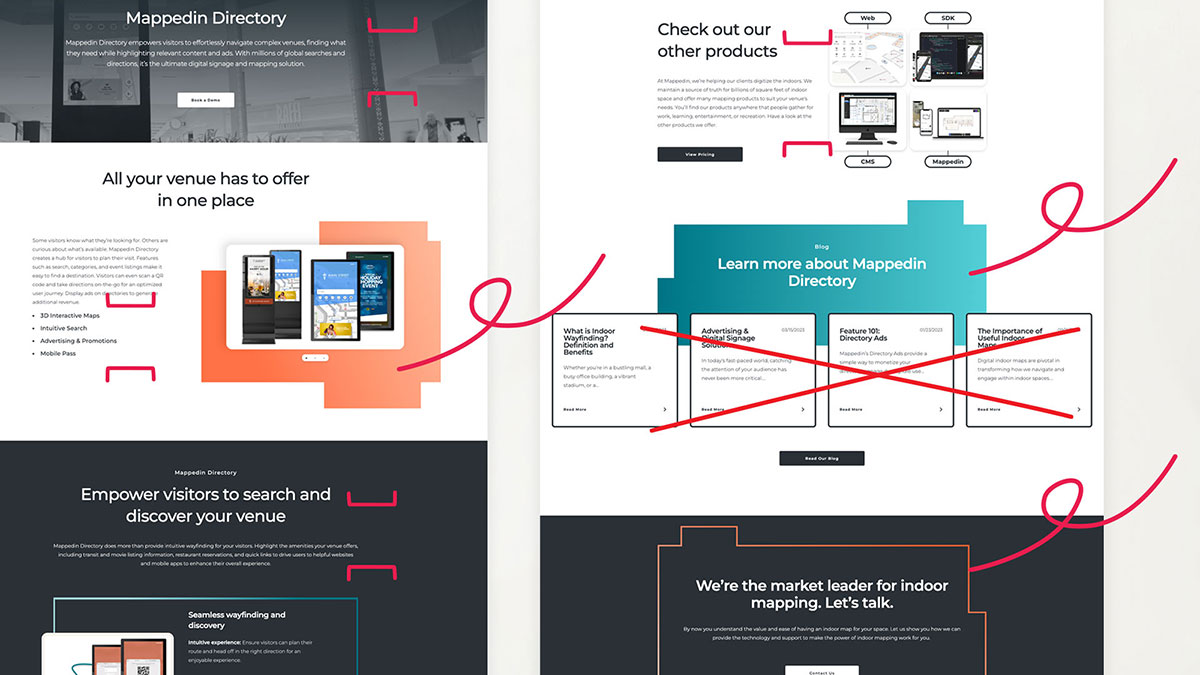
Cognitive load refers to the mental effort required for a person to process information and complete a task. It’s essentially the amount of brainpower being used in your working memory.
Page Updates
Part 2: Restyle after removing unnecessary elements
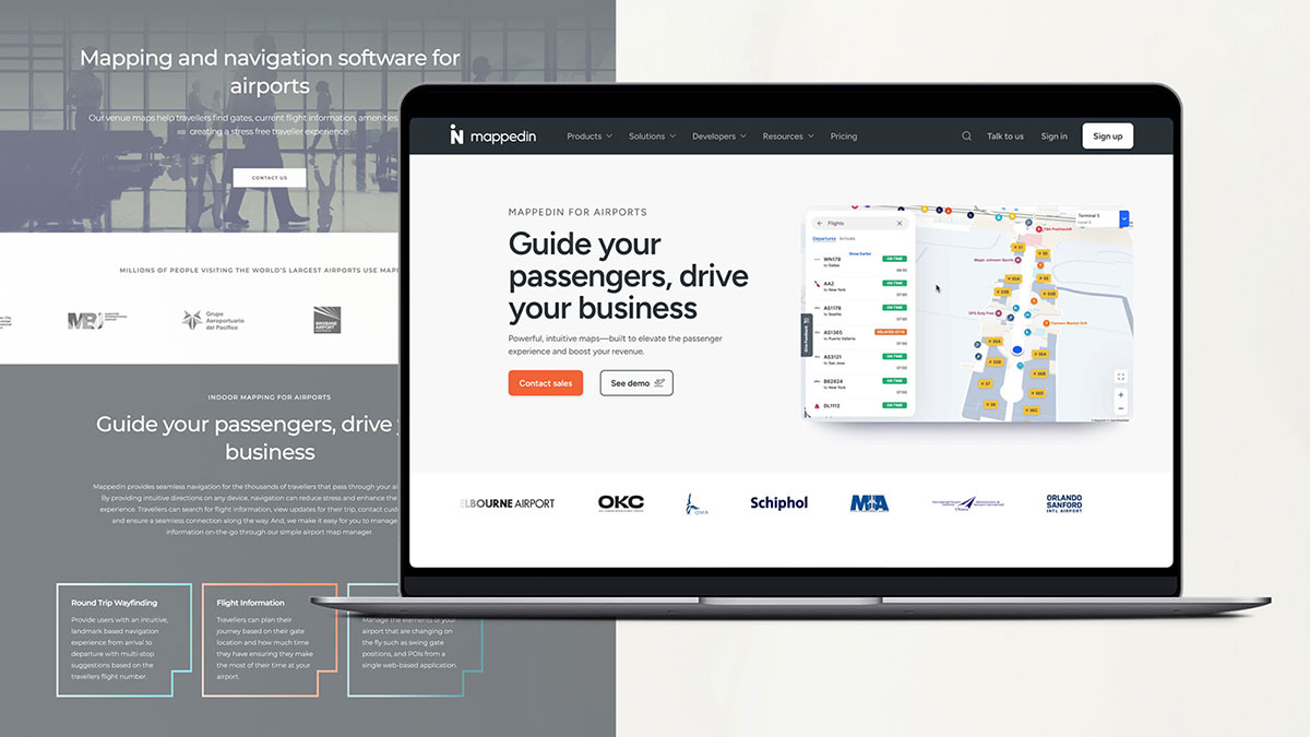
With extraneous content removed, I shifted focus to restoring structure and cohesion to each page layout. This was a significant challenge, especially as we simultaneously transitioned to a new CMS. Initially, we aimed to update a limited set of page templates to accommodate all content types. However, as the redesign progressed, it became clear that the templates constrained creative flexibility. To address this, we opted to develop custom, non-templated pages that enabled fresher content types and enhanced interactivity.
This approach, however, led to increased demand from product stakeholders for additional custom pages. As a result, page launches slowed down since each new custom page required unique elements that our web development team had yet to create. Moreover, each page demanded more time for gathering feedback, revising copy, and making updates.
I deferred this challenge to Phase Two for a more strategic solution.
Lottie Animations
Part 3: Reduce file size and improve page load speeds
The Mappedin website relies heavily on videos to showcase features, but an increasing number of videos per page negatively impacted load times.
Many websites address this issue by using alternative animation formats instead of traditional video. After research and testing, I identified Lottie animations as a promising solution, despite having no prior experience with them.
Embracing the challenge, I taught myself After Effects during my spare time and began creating looping Lottie animations for the site. These animations significantly reduced file sizes, enhanced visual engagement, and simplified the presentation of complex features.
Infographics
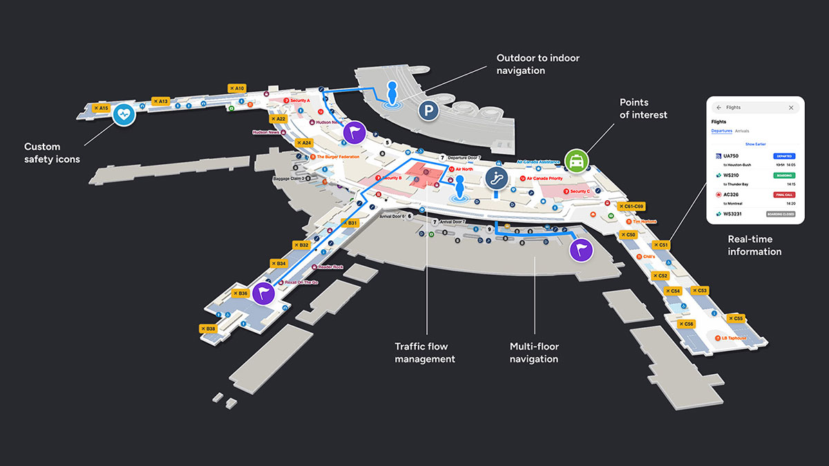
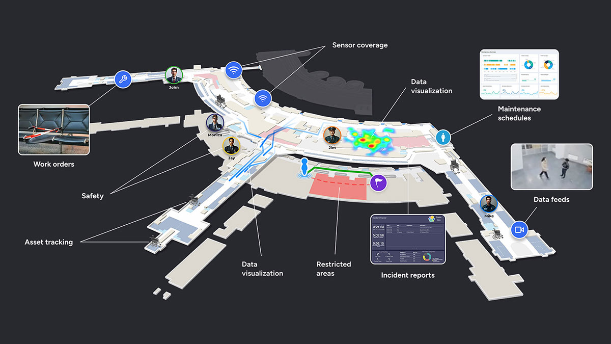
Part 4: Organizing complex information into digestible formats
I chose to create infographics where possible to simplify complex information and make it more accessible to a wider audience. Infographics visually break down key mapping concepts, making them easier to understand and more engaging, compared to overwhelming visitors with technical jargon.
The stage is set
As Phase One neared completion, new challenges emerged:
- The volume of custom pages required exceeded initial expectations.
- The existing brand colours were limiting accessibility, creative flexibility, and overall vibrancy.
Phase Two
Colour
The existing brand guidelines specified a slate grey, an orange, and two shades of teal as Mappedin’s official colours. During Phase One, it became clear that the teal shades served primarily decorative roles, so I phased them out in the updated design to create a more focused and effective colour palette.

Relying solely on the dark grey and orange presented challenges. Although orange served as the primary action colour, its contrast ratio failed accessibility standards. Additionally, the consistent use of this limited palette across social media graphics, tradeshow booths, one-pagers, and presentation decks began to create an unintended ‘🎃 Halloween’ aesthetic.
From my first week at Mappedin, the colour palette was a significant concern, which I communicated to my manager. However, it was decided to maintain the existing colours until the completion of Phase One. Given that Mappedin had engaged an agency for a rebrand just a year prior, a sudden shift in branding was viewed as premature.
This context reinforced my strategy to implement major changes gradually and thoughtfully, beginning with typography and now progressing to the colour palette.
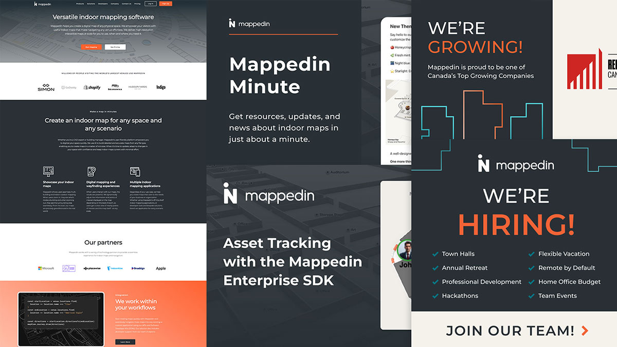
While vibrant and approachable, orange does not align well with the tech industry’s typical visual language. I aimed to shift the palette toward blues or violets; colours widely used by the internet’s most heavily trafficked sites due to their associations with authenticity, reliability, and balanced energy.
Interestingly, increasing the saturation and brightness of the slate grey to 100% produces a blue hue, which became the starting point for refining the brand colour. Using Illustrator, I explored colour harmonies based on the slate grey and selected a high-contrast blue that met our needs. From there, I derived a complementary blue that was both vibrant and versatile enough to be perceived as a shade of purple as well.
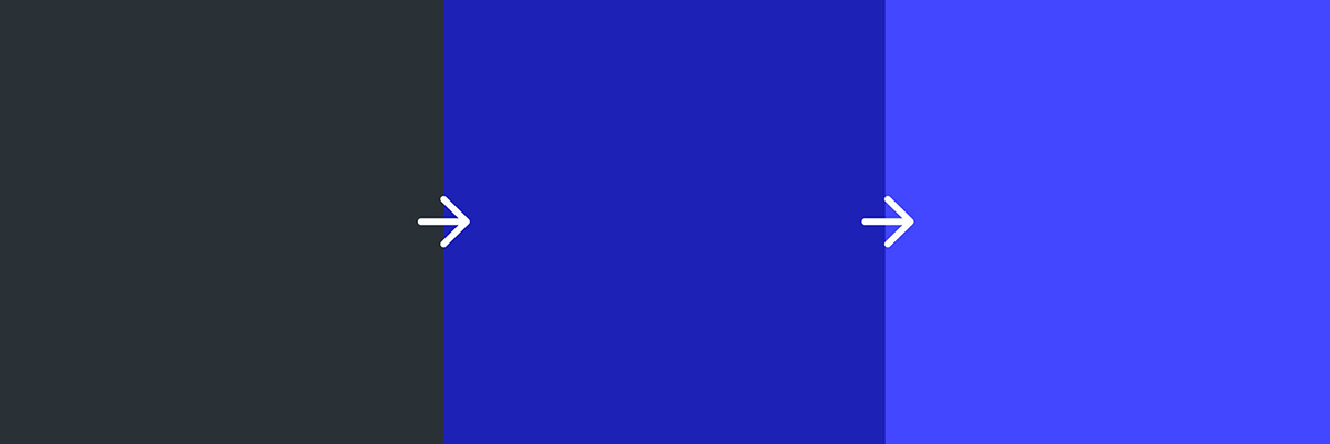
Using the new blue as a foundation, I developed corresponding light and dark shades by adjusting brightness levels. This formed the basis of Mappedin’s refreshed colour palette.

Graphic elements
While refining the colour palette, I also aimed to develop graphic elements and visual styles that would complement the updated Mappedin branding. Since Mappedin’s products focus on indoor navigation, I drew inspiration from architectural symbols, specifically, the doorway, which represents the transition from outdoors to indoors. Floor plans typically depict doors as right angles with a quarter-circle indicating swing direction. I experimented with this shape using solid fills and strokes to create a dynamic, randomized grid pattern.

Isometric illustrations
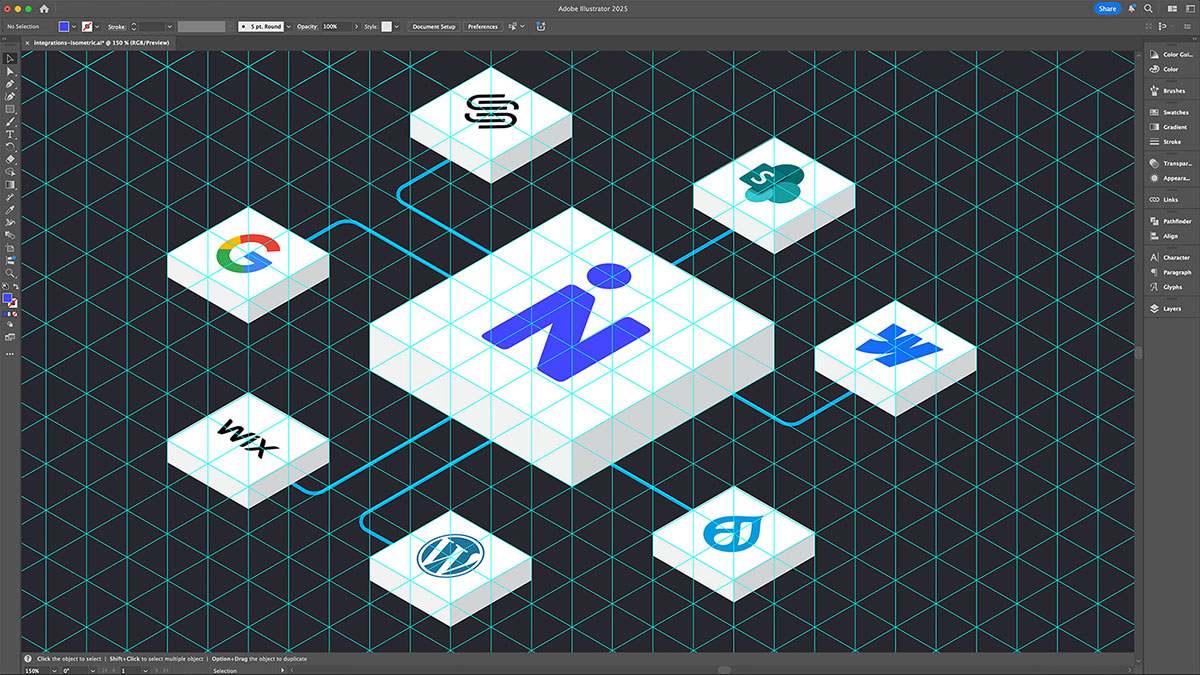
When creating maps using Mappedin’s platform, different colours are assigned to doors, windows, walls, and custom objects. Instead of displaying traditional screenshots or top-down views of these elements on the website, I chose to use an isometric style to add structured visual interest to sections requiring large background images. To build these illustrations, I created a 30-degree grid in Illustrator as the foundational framework.

New web design
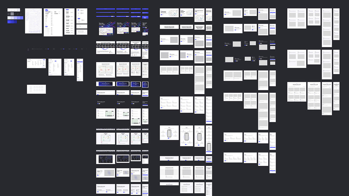
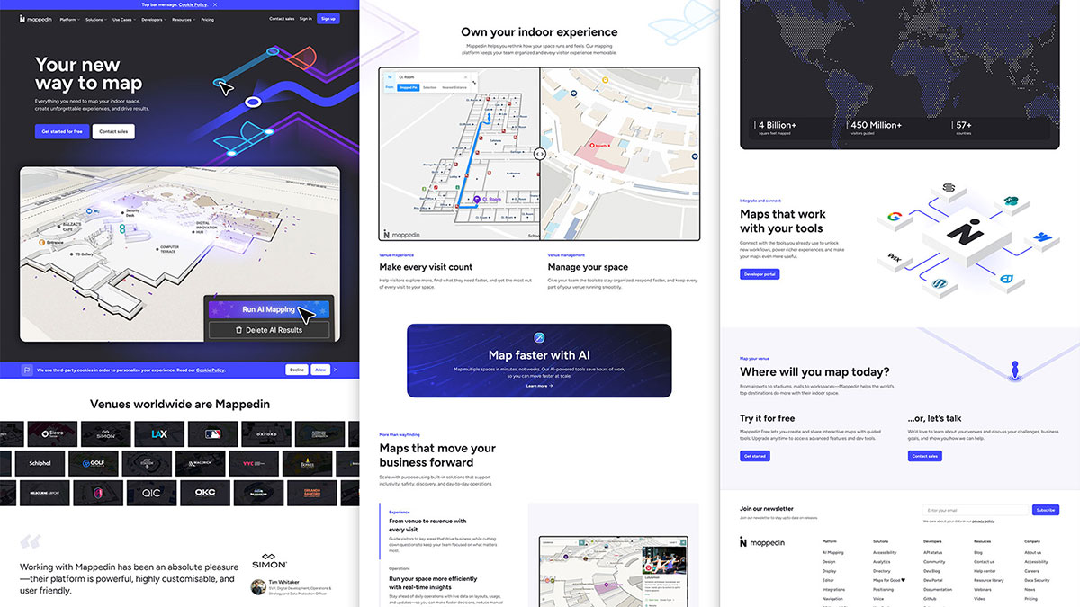
As mentioned earlier, there was a backlog of page builds that highlighted the need for a more efficient process. To address this, I began designing each row and section as individual components tailored to each responsive breakpoint. This approach enabled our web developer to build a reusable component library, streamlining the creation of new pages. When assembling a page, the developer simply pulls the necessary components, leaving only headings, text, and images to be updated.
This strategy has significantly accelerated both our design and development timelines. Work is currently underway to reskin every interior page with the new styles.
Digital ads and social media graphic kits
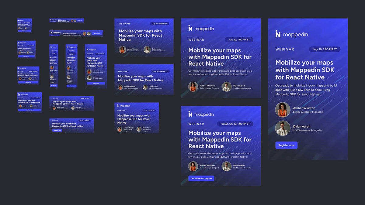
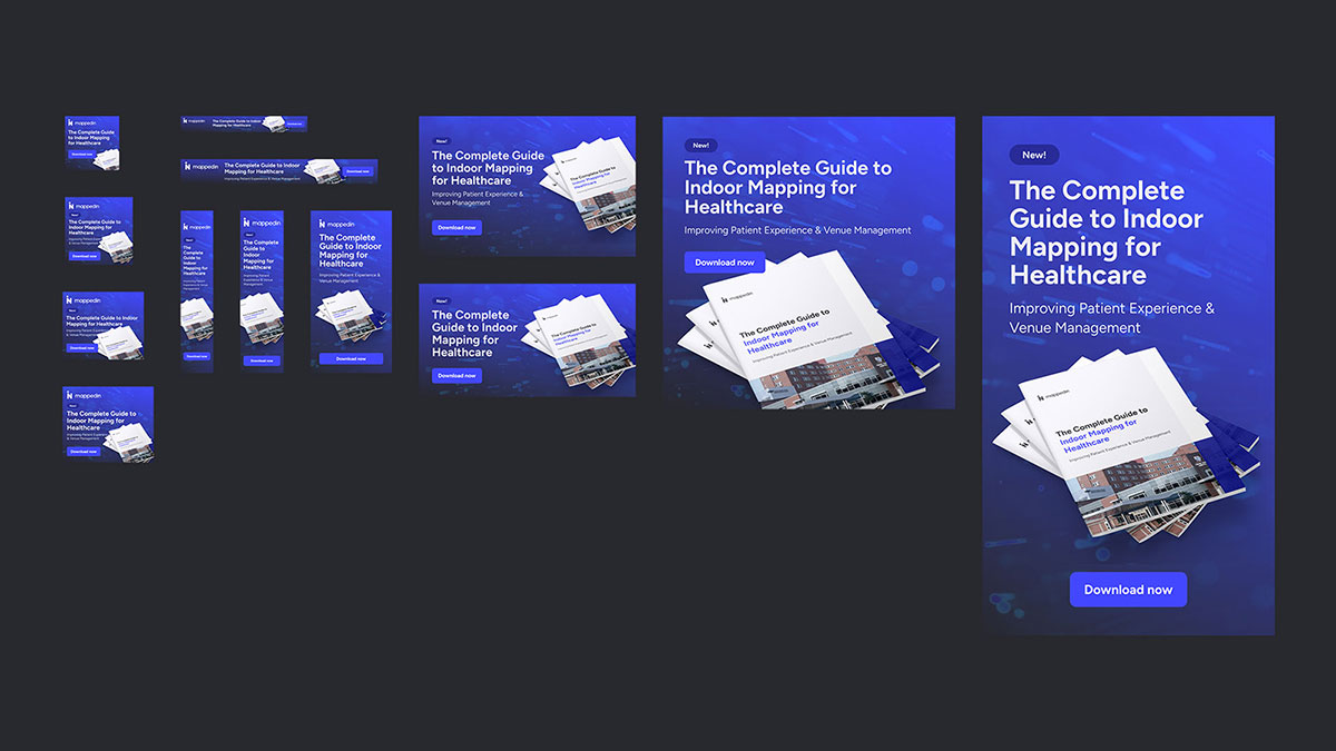
With the introduction of new colours and styles on the website, I also updated all digital ads, social media graphics, email headers, and related materials. I developed a template system that the demand generation and content teams can easily use going forward. Now, they simply duplicate the template, update the content, and export, streamlining the production process.
Print design
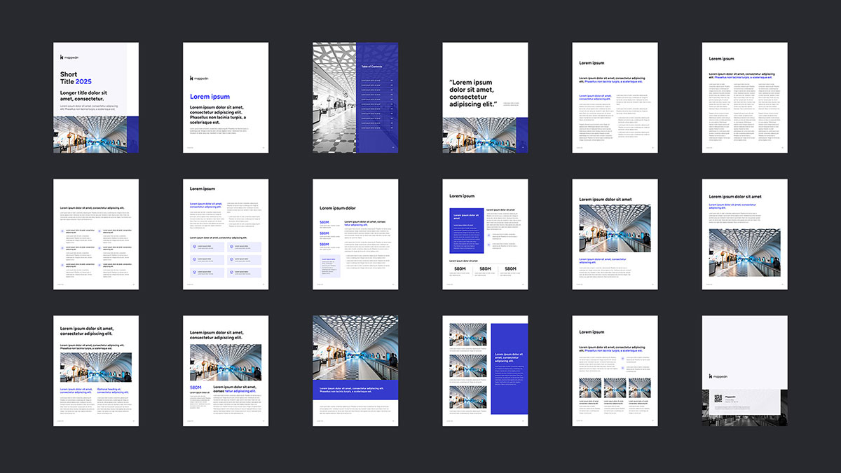
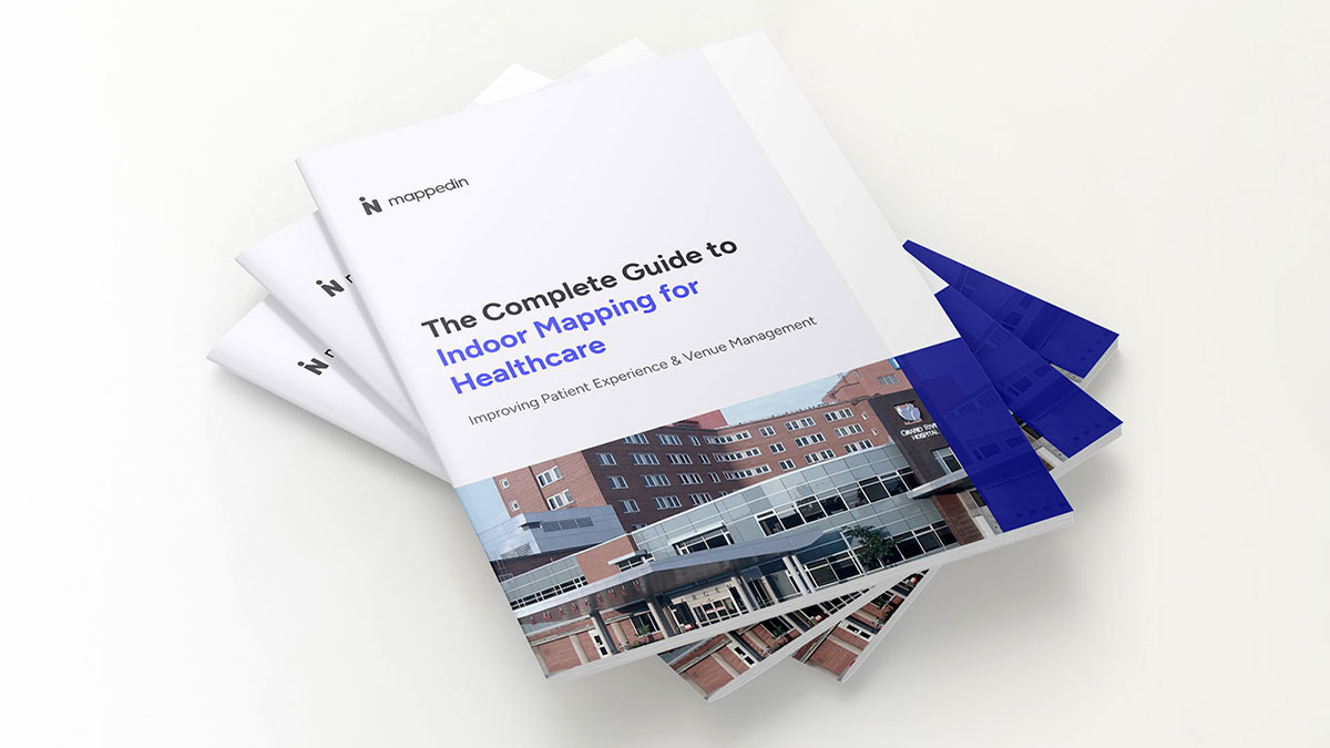
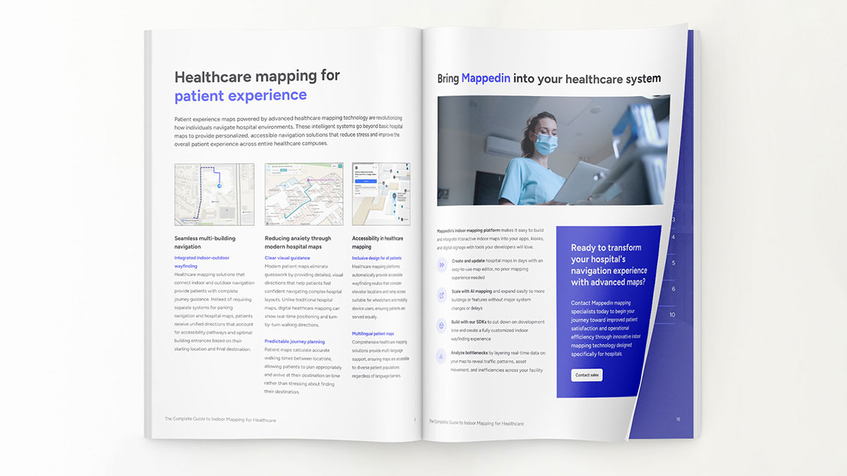
In addition to updating a growing number of digital assets, I designed a new template for downloadable and printable guide booklets, incorporating the refreshed colour palette and typographic scale established on the updated website.
Tradeshow booth design
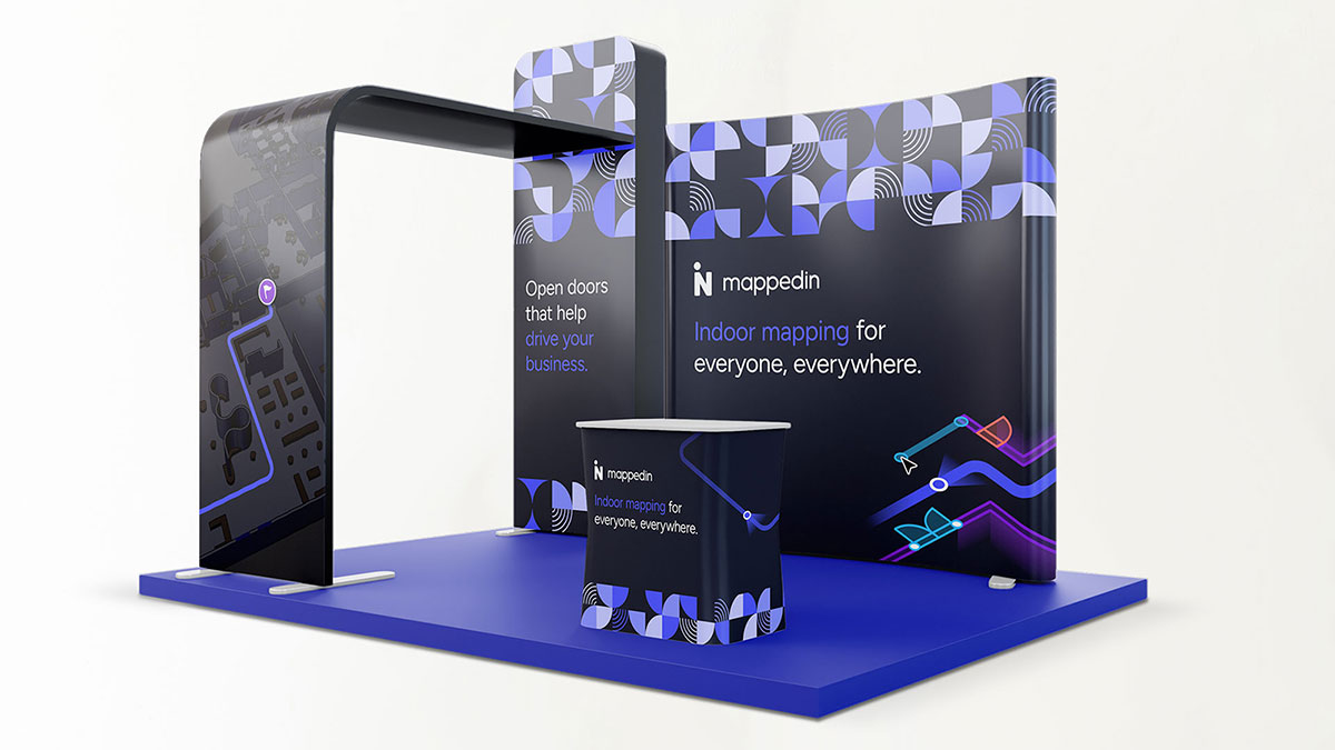
Incorporating all of the updated colours and brand elements, I designed an inviting tradeshow booth. Mappedin is growing to the point where it needs a bigger presence to reflect that growth.
Impact
👨🏻 Frank 12:10 PM
Big shout out to our designer who is absolutely crushing it right now 🔥
@Cam - Fresh off leading our brand refresh, he’s been applying that new system across all our key assets. The new guide and case study templates are a massive upgrade, but the Figma component library is the real game-changer (ping Cam if you’d like a walkthrough). We’re moving 10x faster on landing page production now. Also worth calling out the booth and event materials for MVX and ACI.
- MVX Assets + ACI Booth
- Airport Revenue Guide
- Partner Highlight
Appreciate you 🙌
🔥 15 🚀 17 🙌 13
The comprehensive design updates significantly strengthened Mappedin’s brand cohesion, accessibility, and user experience across all touchpoints. By refining typography, colour palettes, and graphic elements, the brand now communicates with greater clarity, professionalism, and visual appeal, better aligning with its position as a tech leader in indoor mapping. The modular component system accelerated website development, enabling faster content delivery and improved scalability. Meanwhile, optimized animations and updated digital assets enhanced engagement while reducing technical overhead. Together, these changes elevate Mappedin’s market presence, support consistent messaging, and laid a solid foundation for ongoing growth and innovation.