Grae Speakers
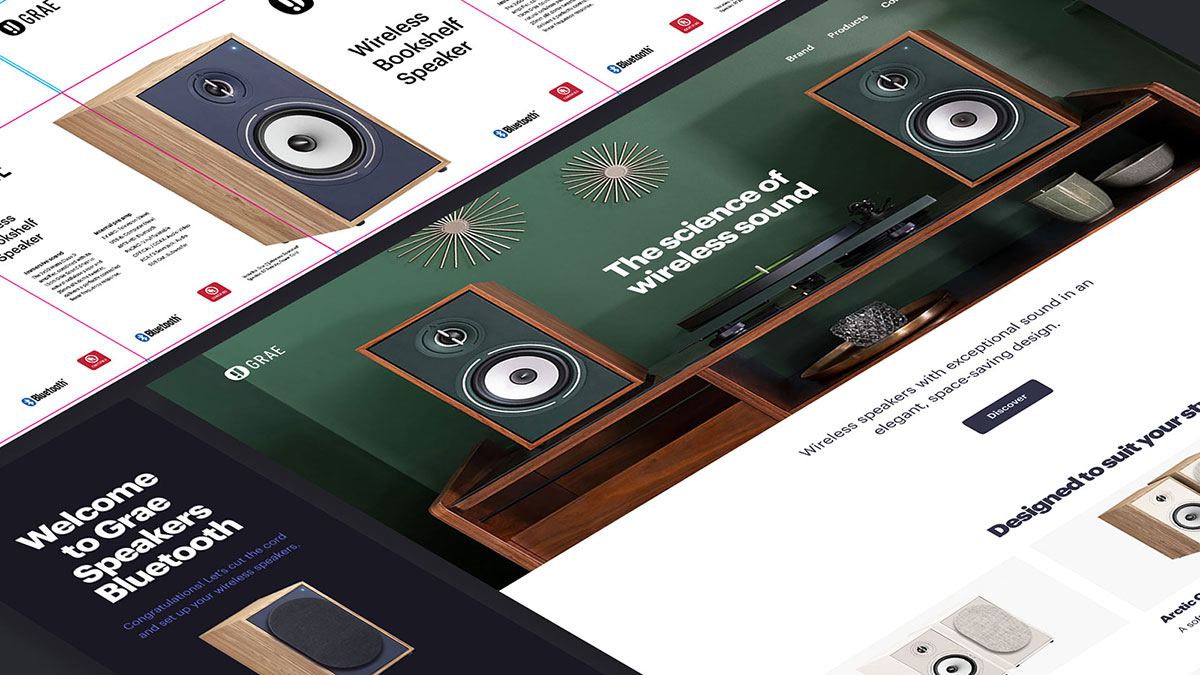
I’m developing a comprehensive brand identity for a conceptual speaker company, including logo design, packaging, a responsive website, and a streamlined app interface.
UI / UX Project Brief
The project was initiated using a randomized online creative brief to simulate real-world client constraints and inspire innovative solutions.
The ideal customer is a woman named Gretchen. Gretchen is in their early ‘40s and lives with their partner. They are a university graduate and work full-time. Gretchen loves music, lives in the suburbs, is familiar with technology, and is comfortable shopping online.
App UI Design
The mobile app I’m designing for Grae Speakers will help enhance the user experience post-purchase. The app is introduced through packaging and marketing materials, prompting users to download it upon receiving their Bluetooth speakers. Once installed, the app guides users through a seamless pairing process, allows them to name individual speakers, test volume levels independently, and manage overall sound settings including master volume and equalizer controls.
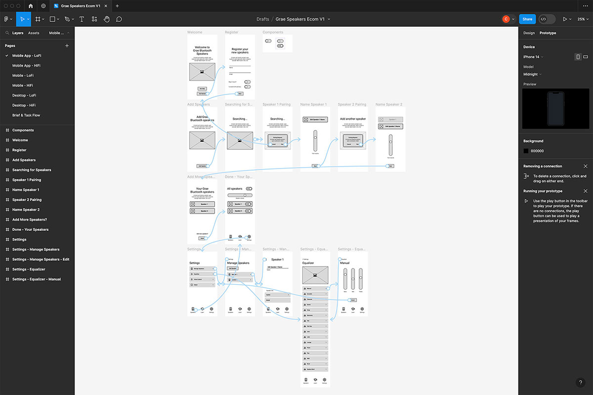
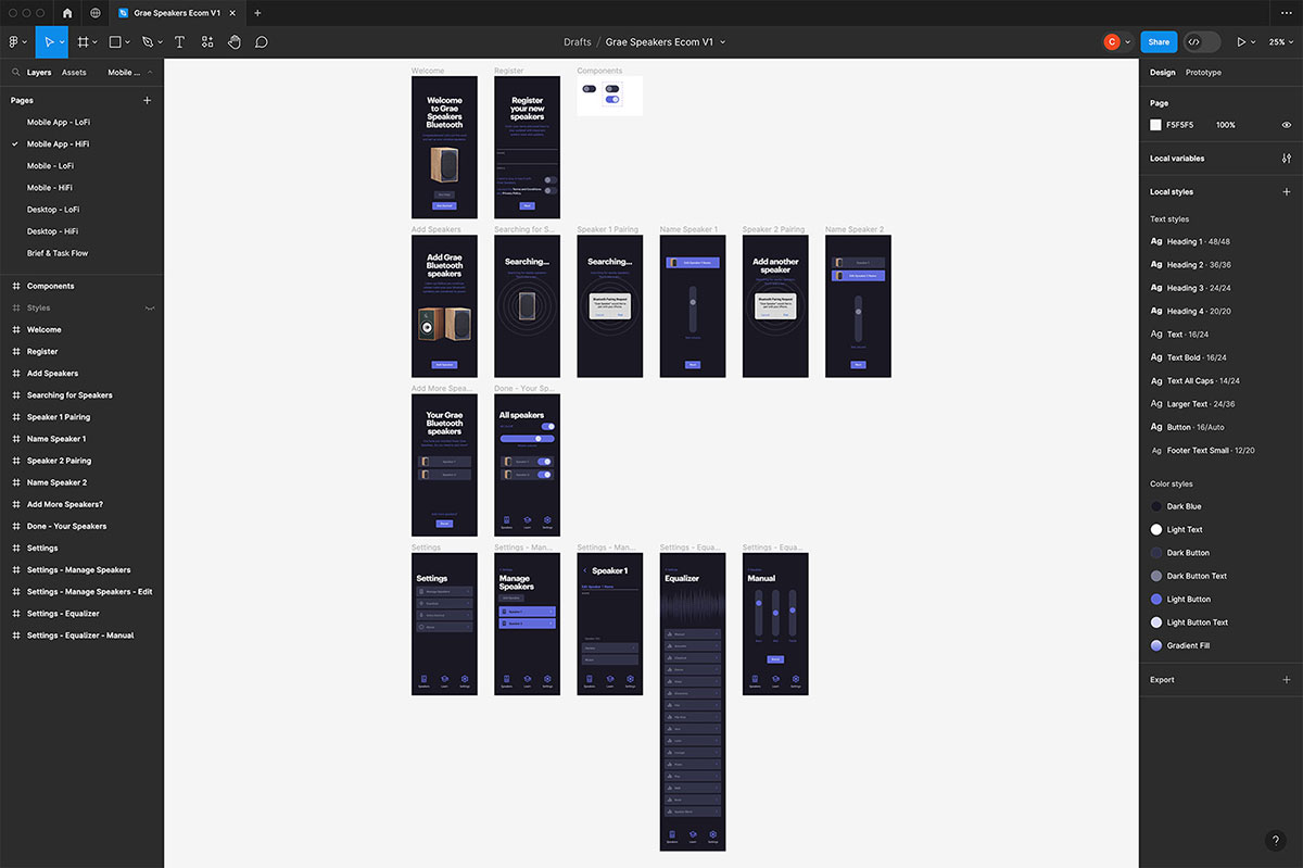
The app prototyping process begins with low-fidelity wireframes to establish layout and functionality. From there, the design evolves into a high-fidelity prototype with applied graphics, colour palette, and typographic styles to reflect the brand’s visual identity.
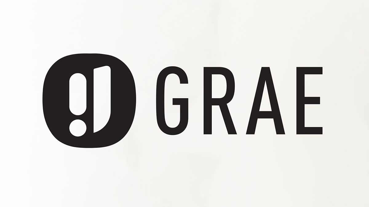
Logo Design
I’m drawn to collecting small pieces of design ephemera, whether it’s photographing faded, hand-painted signage on historic buildings or discovering vintage packaging and typography in antique markets. These personal archives serve as a constant source of inspiration, particularly when designing logos.
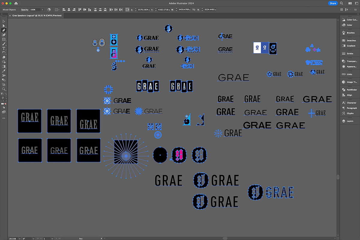
In contrast to the rise of automated logo generators, which often produce generic and overused results, I take a more considered approach rooted in traditional design principles. I start with simple geometric forms, embracing the “less is more” philosophy to achieve clarity, functionality, and timelessness.
My process typically begins with quick notes and loose sketches on paper, but I transition into Illustrator early on to refine shapes and experiment with typefaces and weight variations. From there, I test how the logo interacts with the broader visual system to ensure it integrates seamlessly across all brand touchpoints.
Iteration is key; I continue refining the design until it feels both purposeful and complete.
Web Design
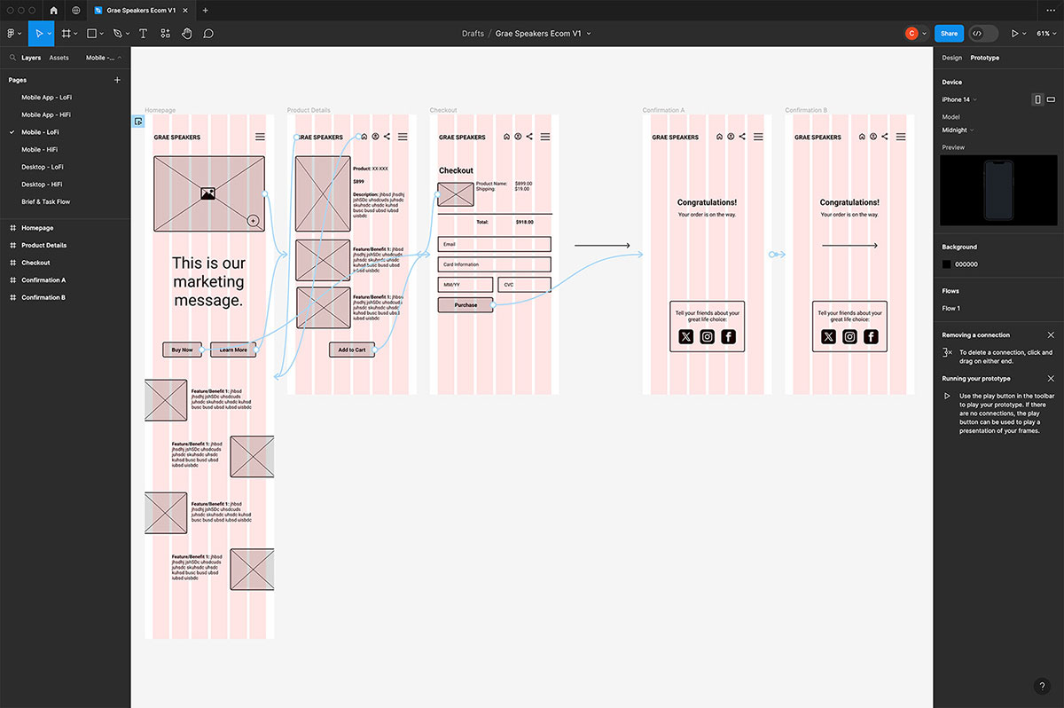
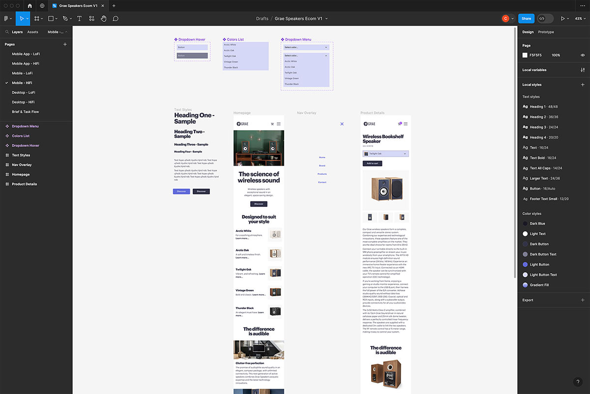
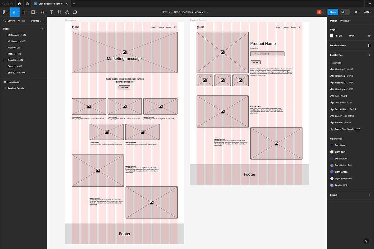
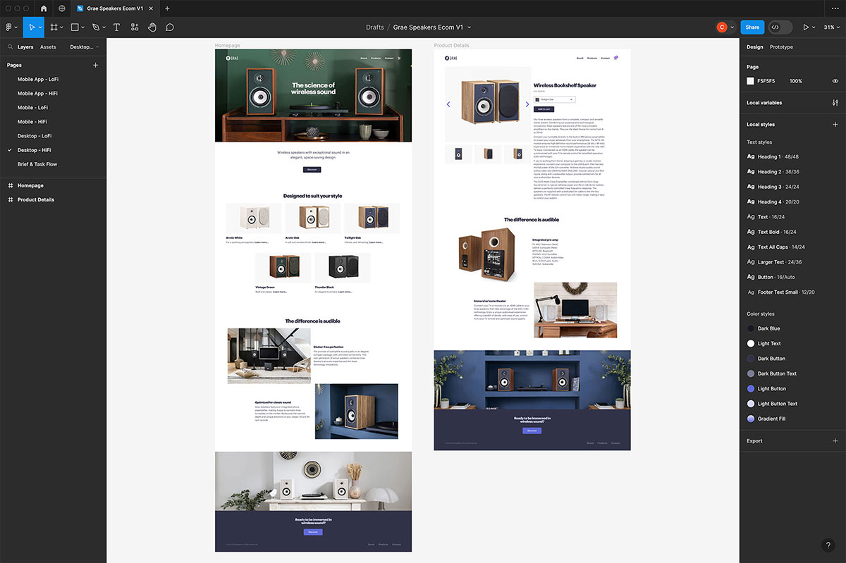
My web design process begins with the smallest viewport. Designing for limited screen space forces a clear hierarchy and helps eliminate unnecessary elements, resulting in a more focused and intuitive interface—even at larger screen sizes.
I use Figma to develop responsive wireframes, carefully considering breakpoints and flexible layouts. In parallel, I create a high-fidelity page that incorporates brand imagery, vibrant colour, and accessible typography. This stage also provides an opportunity to evaluate how the newly designed logo functions within a real UI—particularly in relation to navigation and overall user experience.
For this project, I’m ensuring that font styles and colour choices align closely with the companion app shown above, maintaining consistency across the brand’s digital touchpoints.
Packaging Design
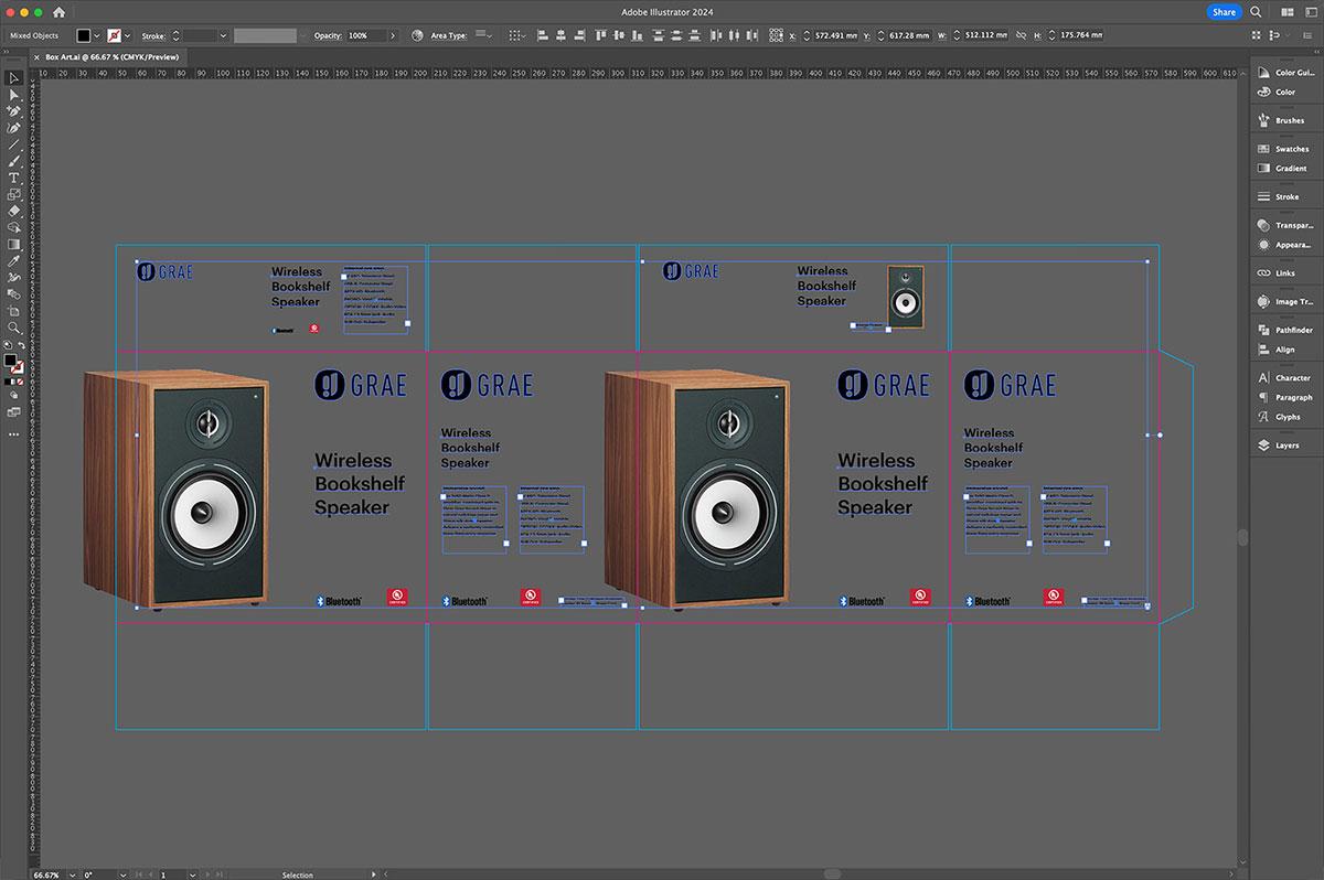
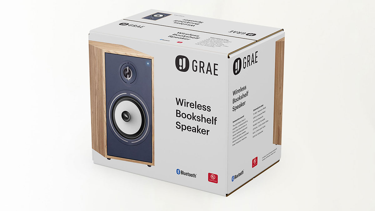
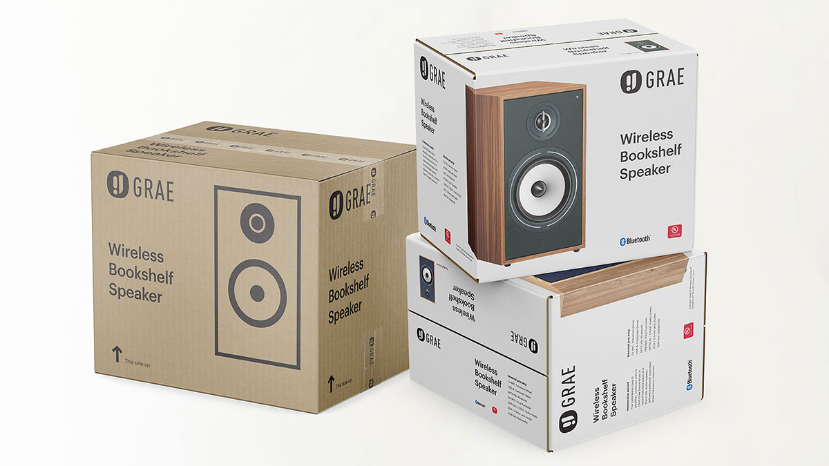
All packaging designs are developed in Illustrator and presented through realistic mock-ups created in Photoshop. I adhere to a cohesive design system for this brand, maintaining consistency in typography and layout structure throughout.
Sales Materials
For all print sales materials, I rely on Adobe InDesign, Illustrator, and Photoshop to ensure precise and high-quality results.
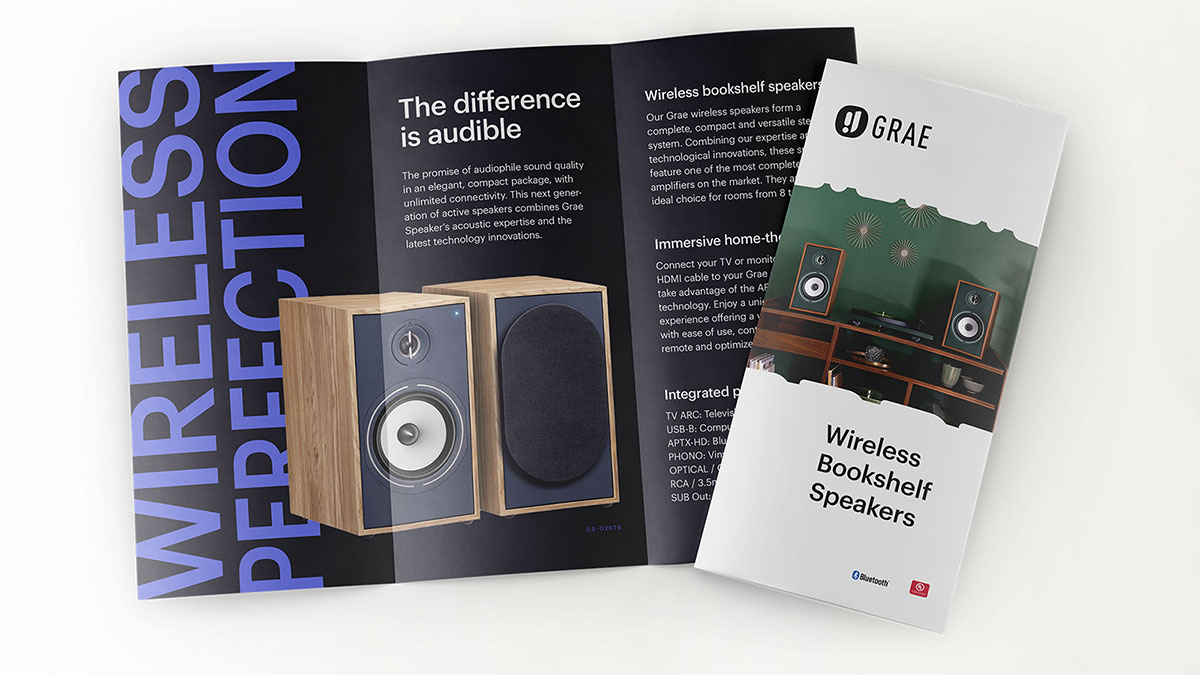
Throughout this project, I apply a thoughtful, detail-oriented approach, whether developing brand identity, designing responsive digital interfaces, or crafting cohesive packaging and print materials. By leveraging industry-standard tools and adhering to consistent design systems, I ensure every component works harmoniously to create a seamless and impactful user experience across all touchpoints.